Blog


Sharing analytics tips, expert advice and industry insights.

A/B Testing for Website Optimization: Part 2

Using Excel to Interpret your A/B Test Results This is part two in a series. If you haven’t read part one about developing an A/B Test, click here. Many A/B Tests are set up to …

Tableau 201: How to Make a Box-and-Whisker Plot

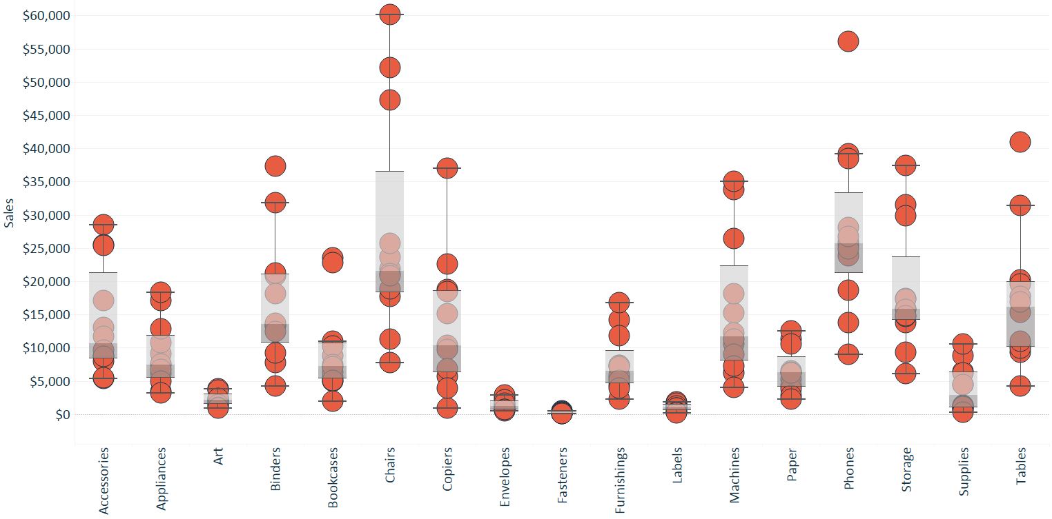
The Box-and-Whisker Plot, or Box Plot, is another effective visualization choice for illustrating distributions. Along with histograms and stacked area charts, Box-and-Whisker plots are among my favorite chart types used for this purpose. They work …
A/B Testing Basics for Website Optimization: Part 1

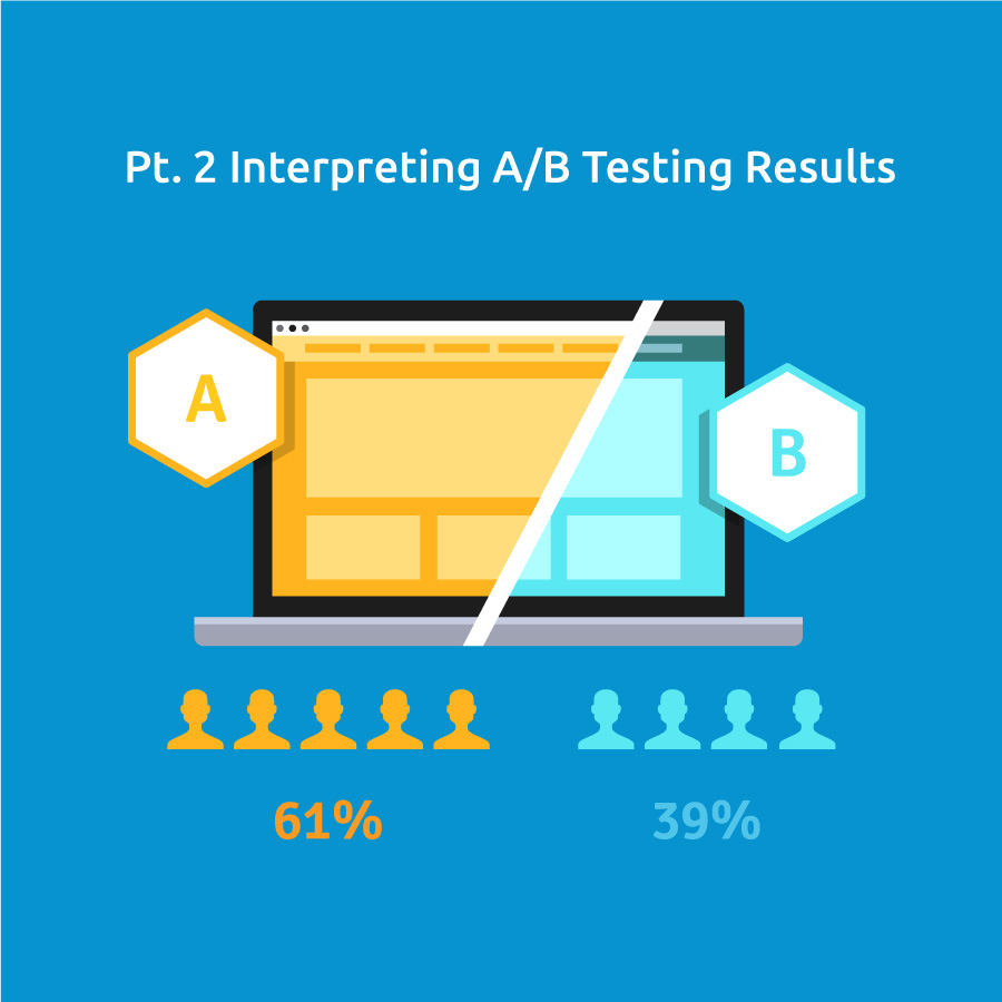
A/B Testing is one of most impactful mechanisms for conversion rate optimization In its simplest form A/B Testing is comparing one holistic website experience to another and measuring based on one key performance indicator (KPI). …

Tableau 201: How to Make a Stacked Area Chart

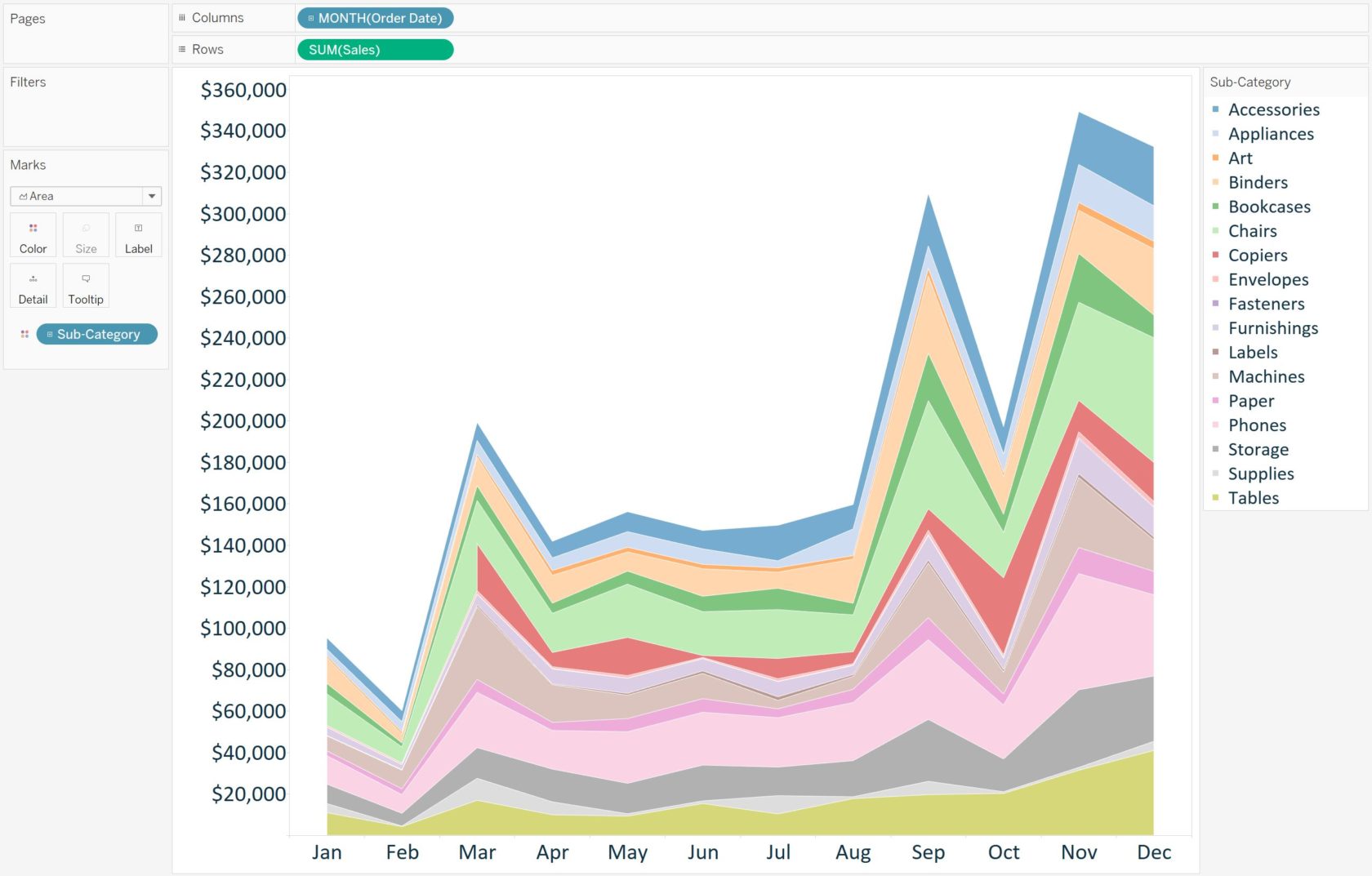
A stacked area chart ‘stacks’ trends on top of each other to illustrate how a part-to-whole distribution is changing over time. When combined with a table calculation that computes the percent of total for each …

Tableau 201: How to Filter Out Partial Time Periods

One of the most panic-inducing visuals in data visualization is a line graph that has a sudden, and steep, decline. When there is truly an issue with the business that needs to be addressed, it …

Tableau 201: How to Equalize Year Over Year Dates

Comparing an exact date in the current year to the same date in prior years – at least on the same date axis – is tricky in Tableau. The challenge comes from the lack of …

Tableau 201: How to Compare Unequal Date Ranges on One Axis

In a previous post, we’ve shared a technique for comparing any date range in Tableau to the equal date range that immediately preceded the selection. But what do you do if you want to pick …

Tableau 201: How to Make a Waterfall Chart

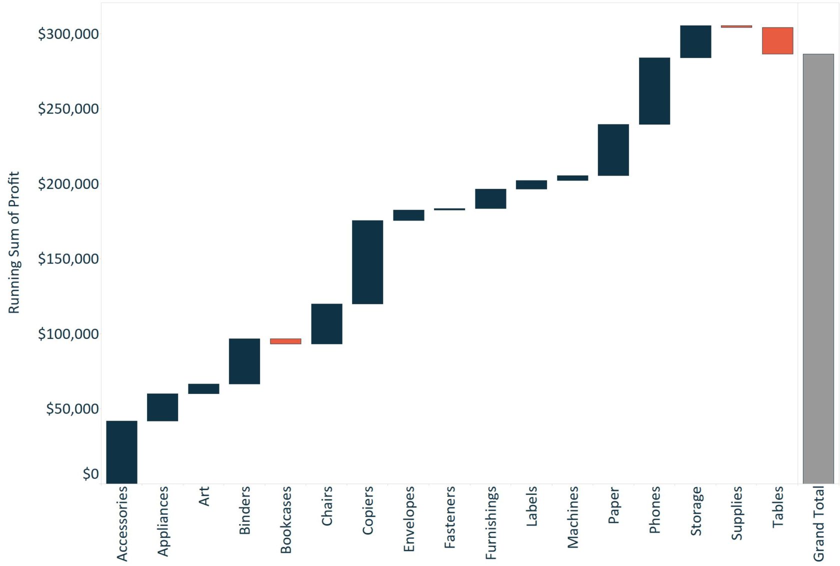
This post shares how to make a waterfall chart in Tableau – a visualization that helps understand how positive and negative values of dimension members are contributing to a total. What makes waterfall charts different …

Observing a Digital Analytics Data Audit

Getting a crash course in everything Evolytics It’s not easy being new at a small company, especially one with such a specialized focus such as Evolytics.  Although there’s certainly some formality to the on-boarding process, …

Tableau 201: How to Make a Gantt Chart

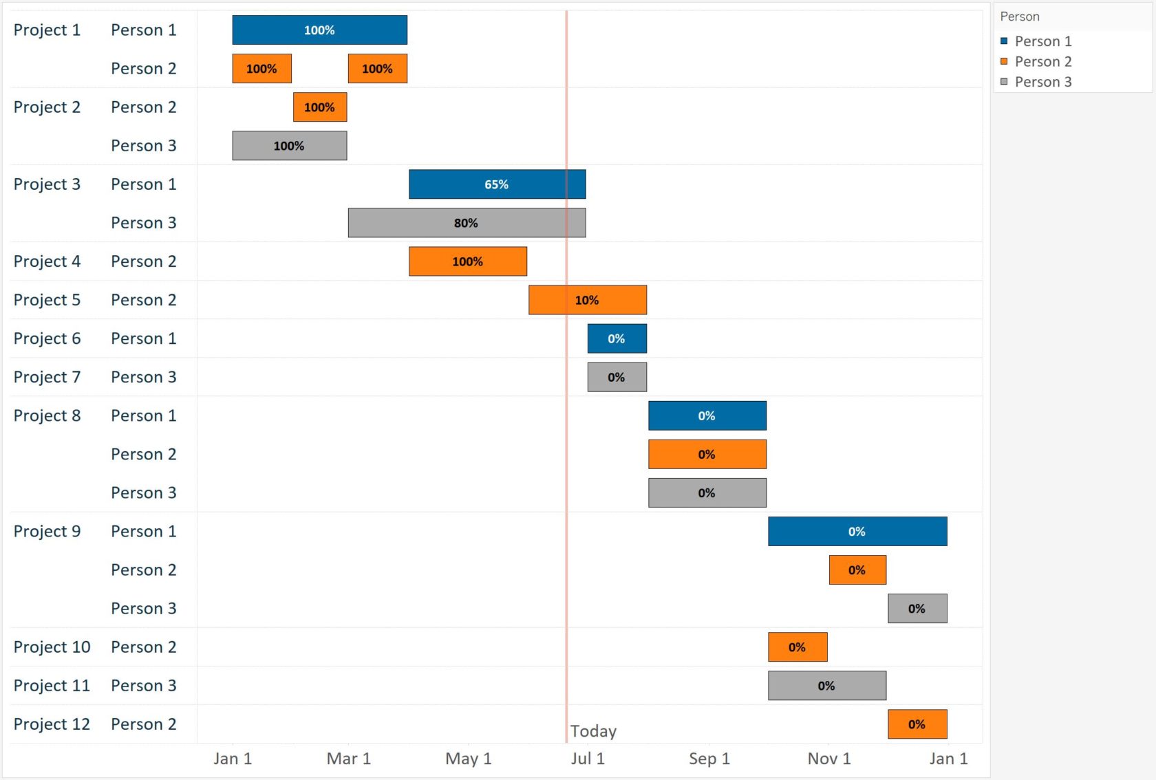
Gantt charts are traditionally used for visualizing project schedules. They are effective for illustrating task durations and dependencies in context of the larger business operation. As with several visualizations that can be built with Tableau, …