Blog


Sharing analytics tips, expert advice and industry insights.

Tableau Fundamentals: An Introduction to Dashboards and Sharing

Individual worksheets in Tableau can lead to powerful insights that help your business, but many times, it makes sense to combine the worksheets into a single dashboard. By combining varying visualizations into a dashboard, you …

Tableau 201: How to Make a Tree Map

A tree map is a visualization that nests rectangles in hierarchies so you can compare different dimension combinations across one or two measures (one for size; one for color) and quickly interpret their respective contributions …

Tableau Fundamentals: An Introduction to Connecting to Data

Once you have chosen the best Tableau product for you, it is time to start finding insights in your data! Much like Tableau’s suite of products, data connections come in many shapes and sizes. As …

Evolytics’ Ryan Sleeper Selected as Tableau Zen Master

Evolytics is thrilled to share the news that Ryan Sleeper, Director of Data Visualization, has been selected as Tableau Zen Master 2016-2017. Ryan has been recognized by Tableau for his mastery of the product, his …

How to Make a Cluster Analysis in Tableau

Clustering is a powerful feature in Tableau that allows you to easily group similar dimension members. This type of clustering helps you create statistically-based segments which provide insight into how different groups are similar as …

Tableau Fundamentals: An Introduction to Sets

Tableau sets allow you to isolate specific segments of a dimension, and can then be used in several different ways to find insights in your data. This post provides instructions on how to build sets …

Tableau Fundamentals: An Introduction to Filters

Tableau provides the ability to filter individual views or even entire data sources on dimensions, measures, or sets. This filtering capability can serve a variety of purposes including minimizing the size of the data for …

Tableau 201: How to Make a Heat Map

Heat maps are a visualization where marks on a chart are represented as colors. As the marks “heat up” due their higher values or density of records, a more intense color is displayed. These colors …

Tableau 201: How to Make a Box-and-Whisker Plot

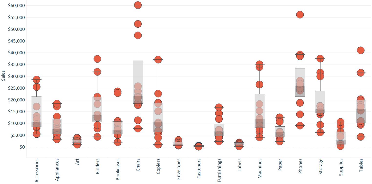
The Box-and-Whisker Plot, or Box Plot, is another effective visualization choice for illustrating distributions. Along with histograms and stacked area charts, Box-and-Whisker plots are among my favorite chart types used for this purpose. They work …

Tableau 201: How to Make a Stacked Area Chart

A stacked area chart ‘stacks’ trends on top of each other to illustrate how a part-to-whole distribution is changing over time. When combined with a table calculation that computes the percent of total for each …